Creating mobile-friendly content is the need for every online business. It is because a huge chunk of online traffic comes from mobile devices. In addition, Google also prefers mobile-friendly sites, ranking them higher on search engine result pages. Therefore, more than having a site that displays perfectly on mobile devices is required. Instead, the content of the website should also be mobile user-friendly.
Mobile users consume information differently than desktop user does. They prefer content that is easy to read, scan, and digest. Moreover, keeping the reader’s interest who is viewing information on a small screen takes a lot of work. Therefore, if your content fails to engage its mobile users, you will miss out on conversion opportunities.
The good news is that creating mobile-friendly content is easier than it may sound. Below are the 12 tips for creating mobile-friendly content.
1. Break Down Content Into Chunks
Due to the small mobile screen size, large pieces of information become challenging to read and consume. Therefore, breaking down content into relatable and meaningful chunks is essential for creating mobile-friendly content.
You can break down your content into chunks by:
- Using brief paragraphs. However, use enough white spaces if you can not avoid long text.
- Organizing information with the help of bullets, lists, tables, and diagrams.
- Including a summary or outline of the content to help readers understand what you will cover in the content.
- Using images to support your content.
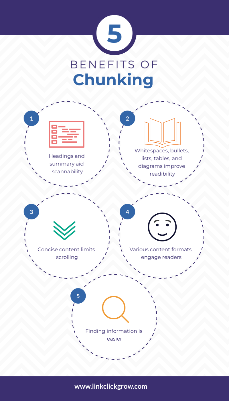
Chunking makes content not only mobile-friendly but also more appealing. It:
- Aids scannability because of headings and summary.
- Improves readability with the help of white spaces, bullets, lists, tables, and diagrams.
- Limits scrolling by keeping content concise.
- Engages readers by using various formats of content.
- Facilitates the audience to find the desired information.
Although chunking is excellent for increasing engagement, use it with care. Some contents are narrative, and you do not want the readers to skip vital information. For example, with how-to-guides, skipping a step can be detrimental.
2. Write Short Titles
The title of a post appears on top of your listing in search engine result pages. The visitors’ decision to visit the page or ignore it is based on the title. On desktop computers, there is more space for titles to display, while on mobile devices, the titles may take up two or more lines. In the worst case, a long title may also get truncated.
Therefore, keep the title short of creating mobile-friendly content, with at most six words. Short titles have higher click-through rates compared to long titles. One of the probable reasons is that short titles do not get truncated on devices with small screen sizes, such as tabs and mobiles. Another likely reason is that readers rarely read the entire title, making short titles more meaningful and engaging.
3. Write an Impactful Introduction
It is challenging to grab readers’ attention and motivate them to read the entire post. It is even more difficult for mobile users as long text becomes daunting for most readers. They are not sure whether to read till the end. However, a solid and impactful introduction can tempt readers to scroll down and read the entire post.
An introduction tells a lot about your content. An impactful introduction can convince its audiences they have come to the right place, while a poor one can make readers navigate away. Following are a few tips to craft a strong introduction:
- Ask or answer questions to let readers know the content will address their challenges or needs.
- Write the introduction at the end when the rest of the document is ready.
- Tell the readers what to expect in the post, but do not make fake promises. Whatever you commit in the introduction should be in the article.
4. Use Short Paragraphs
Long paragraphs often frighten readers, making them lose interest quickly. On the other hand, concise and to-the-point information keeps the reader’s attention. It is because the average attention span of a reader is brief. Therefore, for creating mobile-friendly content, keep paragraphs short, ideally consisting of 3-5 sentences.
Short paragraphs are easy to scan, read, and consume. You can create short sentences by:
- Splitting long paragraphs.
- Removing unnecessary information.
- Limiting one paragraph to a single core point.
- Eliminating necessary words, e.g., in ‘merge together’ together, is redundant.
- Replacing phrases with single words (discussed later).
- Avoid unnecessary adverbs such as ‘totally’, ‘hardly’, ‘simply’, ‘basically’, and ‘actually’. Eliminating these words will not affect the sentence.
- Avoid passive voice. For example, instead of writing ‘The mistake was made by him’, write ‘He made a mistake’.
5. Replace Wordy Phrases with One Word Substitutes
Wordy phrases are a sign of poor writing skills. They make your content long and challenging to read. They also cause distraction, causing the reader to lose interest. As a result, the reader may get frustrated and abandon your content.
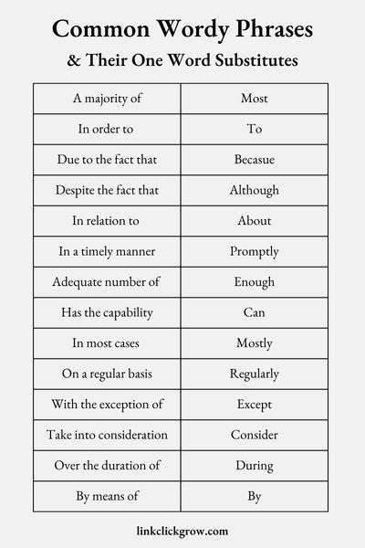
Replacing wordy phrases with shorter substitutes will keep the sentence’s meaning and remain grammatically correct. Therefore, avoid wordy phrases and use one-word substitutes to enhance readability.
Some of the common examples of wordy phrases and their one word substitutes are shown in the figure below:
Grammar checking tools like Grammarly, ProWritingAid, and WhiteSmoke, can also help you detect wordy phrases and suggest shorter alternatives.
6. Replace Complex Words with Simple Synonyms
Most writers try to impress their readers with complex words. While in reality, simple and commonly used words leave a better impression than complex words. Simple words are easy to understand and remember, increasing the usefulness of your content. Mainly, mobile users prefer concise and straightforward content over long and complex. They look for content that conveys information faster, saving time and effort.
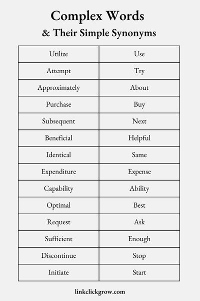
Therefore, replacing complex words with more straightforward and shorter alternatives is essential for creating mobile-friendly and inclusive content. Using simple words can also help you reduce the number of characters making your content concise. Following are a few examples of complex words and their simple alternatives.
7. Use Visuals
Another practical tip for creating mobile-friendly content is using visuals including images, infographics, and videos. Visuals break your content, making it easy to digest. Additionally, mobile users prefer visuals over text. Therefore, whenever suitable, include visuals in your content.
Apart from making your content mobile-friendly, visuals offer many other benefits, such as:
- They make information easy to understand.
- They can communicate more information in less space.
- A human brain can process visual information up to 600 times faster than text.
- People remember visuals longer than they remember text.
- Visuals get more shares on social media, increasing social media engagement.
Canva and Visme are two popular tools for creating graphics, such as infographics, presentations, posters, and flyers. However, you can try marketplaces like envatoelements and shutterstock for high-quality stock images.
For screen recording and video editing, Movavi is an excellent tool. Similarly, you can choose from tools like Doodly, Moovly, Vyond, Powtoon, Adobe Animate, and Animaker for animated videos.
8. Optimize Images and Videos
The use of images and videos can affect your page load speed. For example, a slow-loading page can significantly increase the bounce rate while your search engine rankings may also get affected. Therefore, optimize images and videos to ensure your page load speed is unaffected.
Following are a few tips for optimizing images:
- Choose the suitable format. For example, PNG images are of high quality, but their sizes are enormous.
- Use caching. WP Rocket and WP Optimize are among the best WordPress plugins for caching.
- Use lazy loading and defer the loading of multimedia files until needed. WP Rocket is a popular WordPress plugin you can try for lazy loading.
- Compress the media files. For lossless compression, you can try Smush, a popular WordPress Plugin.
- Resize the images. Image size increases with resolution. Therefore, resize images to maintain a balance between image size and quality.
9. Ensure Call-To-Actions are Clearly Visible
Limited space on mobile screens makes it challenging to place the CTAs where they are visible. It is particularly critical for content that aims at increasing conversion rates. Your conversion rates can significantly suffer if your CTAs are not visible or are pushed down the screen because of a change in screen resolution.
Therefore, strategically place your CTAs to ensure you get all the potential customers. Consider placing them near the top of the post. Make sure completing the action is also mobile-friendly. For example, pay attention to how the form displays on mobile devices. The fields should not overlap or truncate.
10. Focus on White Spaces for Better Readability
Too much text on a small screen can intimidate your audience. As a result, your audience may have trouble concentrating and become confused. In contrast, white spaces lift the pressure off the reader’s eyes and make the screen more reader-friendly.
White spaces are essential for creating mobile-friendly content because of the following reasons:
- They let the reader’s eyes take a rest.
- They help maintain a balance between various chunks of content.
- Scanning and reading content becomes more effortless.
- They highlight essential elements. For example, plenty of white space around call-to-action shows its significance.
- The human mind gets attracted to something that differs from the rest, such as white spaces.
- They act as visual cues and aid in processing information. For example, less white space between chunks implies they are related, while more white space shows unrelated elements.
- They are visually appealing, making content attention-grabbing.
11. Preview Your Content on Mobile Device Before Publishing
You may have followed all the tips mentioned above for creating mobile-friendly content. But you risk losing the audience if you don’t preview your content before publishing. It is critical to check your content on a mobile device to assess if it appears as expected.
In most cases, you will find something you can improve. Preview your content from a reader’s perspective and assess:
- If it is easy to read, scan, and understand? If not, further break down your content.
- Are there paragraphs that look long? If yes, make them short by eliminating redundant words and unnecessary information or splitting the paragraph into two.
- Is there enough breathing space for your eyes? If not, add white spaces.
- Are there enough visuals? If not, add visuals.
- Is it taking long to load? If yes, optimize images and videos.
Conclusion
With the increasing number of mobile searches, ensuring your content looks as appealing on mobile devices as on desktop is critical. Failure to create mobile-friendly content can badly affect your reputation and cost you valuable conversions. Therefore, for a solid online presence, consider the above tips for creating mobile-friendly content that can help you boost traffic, page views, sales, and conversions.





0 Comments