Visitors come to your site for a reason. It could be seeking answers to their questions, looking for solutions to their problems, or buying a product or service. However, without an optimal user experience, the visitors may not achieve their goal. Consequently, your business also fails to achieve marketing goals. Therefore, it is essential to have elements on your website, i.e., calls to action or CTAs, that can guide users in the customer's journey and encourage them to take appropriate actions.
What Is a Call To Action?
A call to action or CTA is an element of a website, email, landing page, or social media post that prompts users to take a desired action beneficial for business goals. It encourages visitors to turn into leads, leads into customers, and customers into brand ambassadors.
A web page can have multiple CTAs depending on the business's marketing goals. Similarly, an email campaign can also have numerous calls to action. However, social media posts mostly have only one call to action per post.
A good CTA helps guide customers along various stages of the buying journey. Customers may otherwise abandon your site without direction and turn to competitor sites. Similarly, a good call to action encourages customers to keep interacting with your brand.
Different Forms of CTAs
You can use different types of calls to action for various marketing goals. However, remember, what works for one business may not work for you. Therefore, you must A/B test CTA types, designs, and placement to determine what works best for your audience.
The following are the major types of CTAs used in marketing campaigns:
Buttons
Buttons are the most common type of call to action. They can serve several goals, such as acquiring new customers and generating leads. Buttons are clickable elements and have an actionable text that prompts users to take action. A few examples of button CTAs are:
- Share now.
- Buy now.
- Learn more.
- Add to cart.
- Checkout.
- Apply now.
- Book now.
- Follow us.
However, to ensure buttons catch visitor's attention, use bold and high-contrast colors.
Links
Links are clickable text embedded within content. They often take the users to a landing page or another page where they can perform a specific action. The following are the most common contextual link CTAs used in content marketing:
- Read more.
- Try now.
- View now.
- Get estimate.
Unlike buttons, you do not need to design links. Contextual links mostly have the same font as the surrounding text.
Pop-Ups
A pop-up call is a small window that appears on your screen suddenly. Within the pop-up, you can have a button CTA. Pop-up creates urgency, which is an essential feature of CTAs. It usually appears when the user has reached the end of the page. It may also appear just before the user leaves the page.
Pop-up CTAs are commonly used for the following actions:
- Subscription.
- Download content.
- Start a free trial.
- Join now.
- Call now.
- Book a free consultation.
- Get an estimate.
Optinmonster is a popular WordPress plugin for creating pop-ups. Its exit intent technology is a great feature that lets you show pop-ups when a visitor is about to leave the page.
Banners
Banners are a form of advertisements that appear on the top, bottom, or side of a web page. They usually announce an offer, event, or a new product. They can have a call to action in the form of a link or a button. Popular CTAs on banners include:
- Get offer.
- Register now.
- Join now.
- Redeem coupon.
You must design banners carefully to make them appealing and compelling. Ideally, A/B test variations of banners to determine what attracts your target audience the most.
Forms
Forms are famous for generating new leads. They prompt visitors to provide their contact information in exchange for something of interest, such as guides and exclusive material. The following are a few examples of form CTAs.
- Download content.
- Subscription.
- Sign-ups.
- Free trial.
- Contact us.
- Get demo.
- Register for a free event.
To design and build an eye-catching form, you can use Optinmonster. It enables designing opt in forms using drag and drop builder. Using optinmonster, you can create floating bars, inline forms, and sidebar forms.
What is a Good CTA, and Why It is Important?
A good call to action stands out, grabs visitors' attention, and leads to the desired action. On the contrary, a bad CTA turns visitors away and makes you lose potential customers. Several factors contribute towards a good call to action, such as:
- Design.
- Color scheme.
- Text length, font, and size.
- Location.
Most importantly, a good CTA is designed according to the marketing goal. Calls to action can be divided into the following types based on the intention:
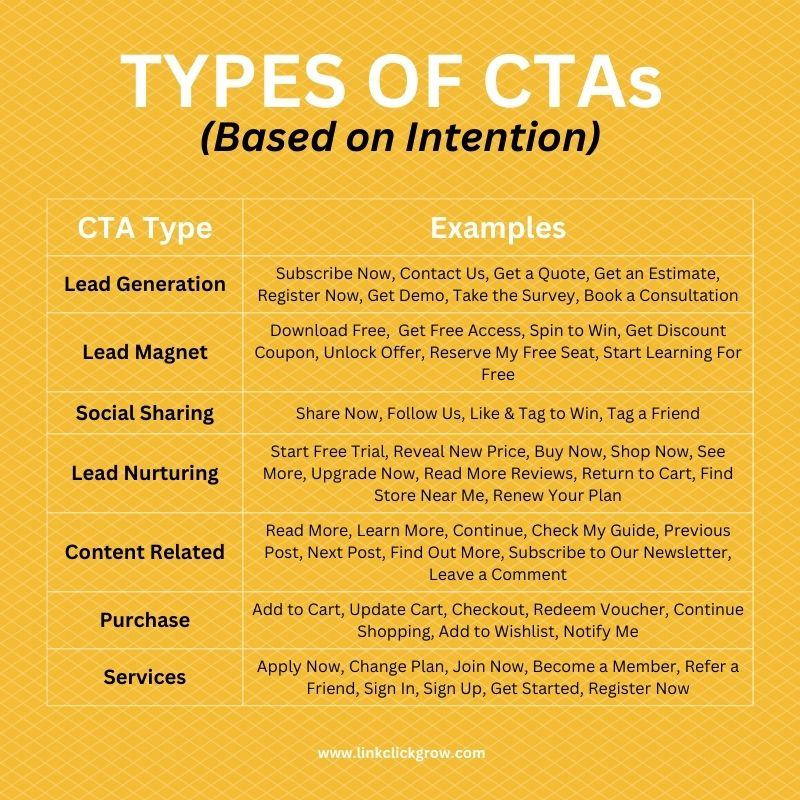
A good CTA is beneficial for businesses for the following reasons:
Eliminates Confusion from Decision Making
Without clear directions, users may not know what to do next. The users may leave your site out of frustration and confusion. Worse, they may turn to your competitors for a better user experience.
A good call to action tells users how to proceed and what actions they can take. As a result, the customer's journey becomes clear, eliminating confusion from decision making.
Increases Engagement
A popular way to increase user engagement is to convince visitors to follow you or share your content on other platforms. Without a call to action, the users will likely exit your webpage without taking any further action. However, a good call to action, such as a social sharing button, encourages users to keep interacting with you on social media platforms.
To add lightweight social sharing buttons on web pages, blog posts, or e-commerce products, you can use a popular WordPress plugin, Novashare. Divi theme also comes with a social sharing plugin, Monarch. Using Monarch, you can also add follow us buttons on your blog posts.
Boosts Lead Generation
CTAs are essential components of marketing campaigns. They are marketing tools to generate leads and grow business. Visitors are unlikely to proceed and become leads if you do not prompt them to take appropriate action. Calls to action, being marketing agents, influence visitors' decisions and persuade them to turn into leads by subscribing, signing up for newsletters, attending a webinar, participating in a contest, or downloading a resource.
Increase Sales and Revenue
It is improbable that people would navigate your site and look for products. However, CTAs make it easy to locate products and services. Placing calls to action on various significant pages of your site ensures that visitors are aware of your offerings. As a result, the number of sales and revenue increase.
Help Collect User Information
The journey of a user becoming a customer takes time. A business needs to engage with the prospects to convert them into customers. However, you can only engage with the prospective customers if you have their contact information. Therefore, it is critical to collect user information whenever possible.
An efficient way to collect user information is through CTAs, such as subscriptions, sign-ups, or free downloads. Once you have users' information, you can send them relevant material, offers, and news, encouraging them to become customers.
Best Practices for Creating a Good Call to Action
The following are a few proven tips for creating compelling CTAs:
Place It Where It is Easily Visible
Whether it is an email or a webpage, the location of calls to action is critical to boosting the click-through rate. If the call to action is not easily visible, people will likely skip it. On the contrary, CTAs that stand out and are easily noticeable get more clicks.
Ideally, keep the call to action above the fold to ensure the users do not miss it even if they do not scroll down the page.
Surround it with White Spaces
Elements of a webpage or email that do not have enough space around them are often overlooked. They are often lost in heaps of content. On the other hand, white spaces make it easy to scan a page and help elements stand out.
Since a good CTA exists to achieve marketing goals, it must appear prominent. Therefore, surround calls to action with white spaces so that they can easily catch attention.
Keep the Text Short
Although there is no hard and fast rule regarding CTA text, it should ideally not exceed seven words. Writing long sentences is unnecessary, as they may turn visitors away. Instead, convey your message shortly and concisely.
Short CTAs perform better than longer ones. For example, instead of "Download the ultimate guide to guest blogging for free", write "Download the guest blogging guide now".
Use Simple Language
Simple language can significantly increase the effectiveness of a CTA. Do not use jargon, abbreviations, technical words, or long phrases. Instead, use simple language that is easy to comprehend for audiences of all knowledge levels.
Remember, your audience is a mix of people with different knowledge levels. Therefore, ensuring every element of your marketing strategy caters to all audiences is essential.
State a Clear Benefit
Stating a benefit helps users in the decision-making process. A visitor who has come to your site just for information may get tempted to sign up if you declare a benefit. Therefore, if you offer a free quote, download, estimate, or trial, mention it clearly to influence the actions of the users.
"Book a free session", "Sign up and save 20%", and "Join free for 30 days", are a few examples of CTAs that specify benefits to increase click-through rate.
Use Action Verbs
Action verbs depict an action, such as:
- Join
- Buy
- Register
- Call
- Subscribe
- Book
- Apply
Starting a CTA with an action verb makes it immediately apparent to the visitors what action you are encouraging them to take. Action verbs make CTAs more meaningful and add energy to the message.
Create a Sense of Urgency
Creating a sense of urgency can significantly enhance the effectiveness of CTAs. It encourages users to take immediate action instead of delaying it. It is human psychology that if they fear missing out on something, they act instantly. Therefore, to ensure users respond right away, add a sense of immediacy to your CTAs.
An excellent way to influence users to take quick action is to highlight a limited-time offer. Similarly, you can add phrases like "X number of seats left", "for today only", or "register now".
Another effective way to create a sense of urgency is adding a countdown timer to your CTA forms. Optinmonster allows adding both static and dynamic countdown timers to forms and pop-ups.
Be Creative with Design
Designing a call to action is a tricky task. A well-crafted CTA stands out and catches the attention of the audience. The more people get attracted to a call to action, the more clicks you will get. The following are a few tips you should follow when designing CTAs:
- Use bright and contrasting colors.
- Use an easily readable font size.
- Ensure the pop-up, button, or banner appears well on all screen sizes.
- Experiment with different shapes of the button.
- Add graphics to your buttons, such as an arrow. However, ensure the graphic is not misleading and accurately represents the action.
Use First Person Speech
One way to boost the click-through rates is to use first person speech. For example, instead of "Get your free kit", write "Get my free kit". First person speech makes it appear as if the offer is especially for them.
Add a Personal Touch
People tend to like and remember what they find unique. Adding a personal touch to CTAs makes them appealing and positively impacts the visitors. Most importantly, the click-through rate can significantly increase. Come up with something unique that is different from the rest. For example, you can write "Plan my escape" if you offer travel services.
A/B Test CTAs
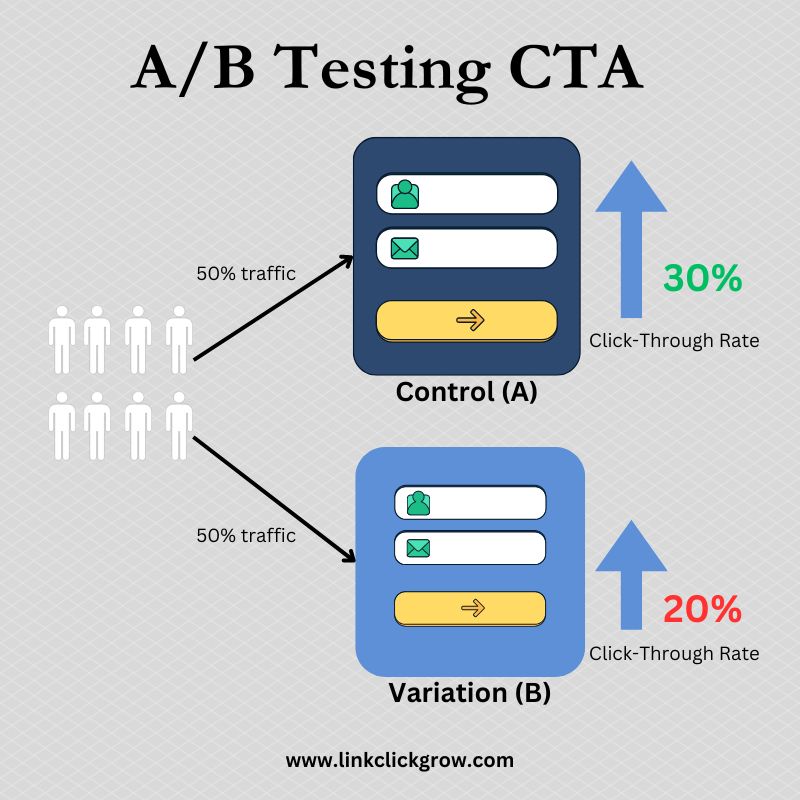
Despite following all the best practices, it is advisable to always A/B test CTAs. A/B testing is a marketing experiment in which you present two versions of an element to distinct and random audience groups. You get to know what works best with your audience based on the results.
You can A/B test a CTA's font, action text, size, color scheme, or placement. However, test only one variable at a time to better understand the result. If you test multiple variables simultaneously, it would become difficult to determine which change resulted in a performance boost.
Conclusion
An effective marketing strategy aims to drive sales and generate leads. Despite having great content and an attractive website, you can only achieve your marketing goals if you incorporate CTAs in your strategy. However, following the above-mentioned best practices to achieve the maximum click-through rate is equally critical.




0 Comments